These Charts And Maps Show How The Coronavirus Is Spreading Across The World
Source: Buzzfeed
COVID-19, the disease caused by a novel coronavirus first identified late last year in Wuhan, China, is spreading across the globe. The charts and maps below will update automatically with the latest data compiled from WHO and other sources by researchers at Johns Hopkins University.
The New Cases tab shows what experts call the “epidemic curve,” in which the number of cases newly diagnosed each day typically rises over time and then falls. New case numbers have already declined in China, where stringent quarantine measures were put in place to try and limit the spread from the initial epicenter of COVID-19 in Wuhan.
The big question is what will happen now that the virus has started to spread from person to person in other countries.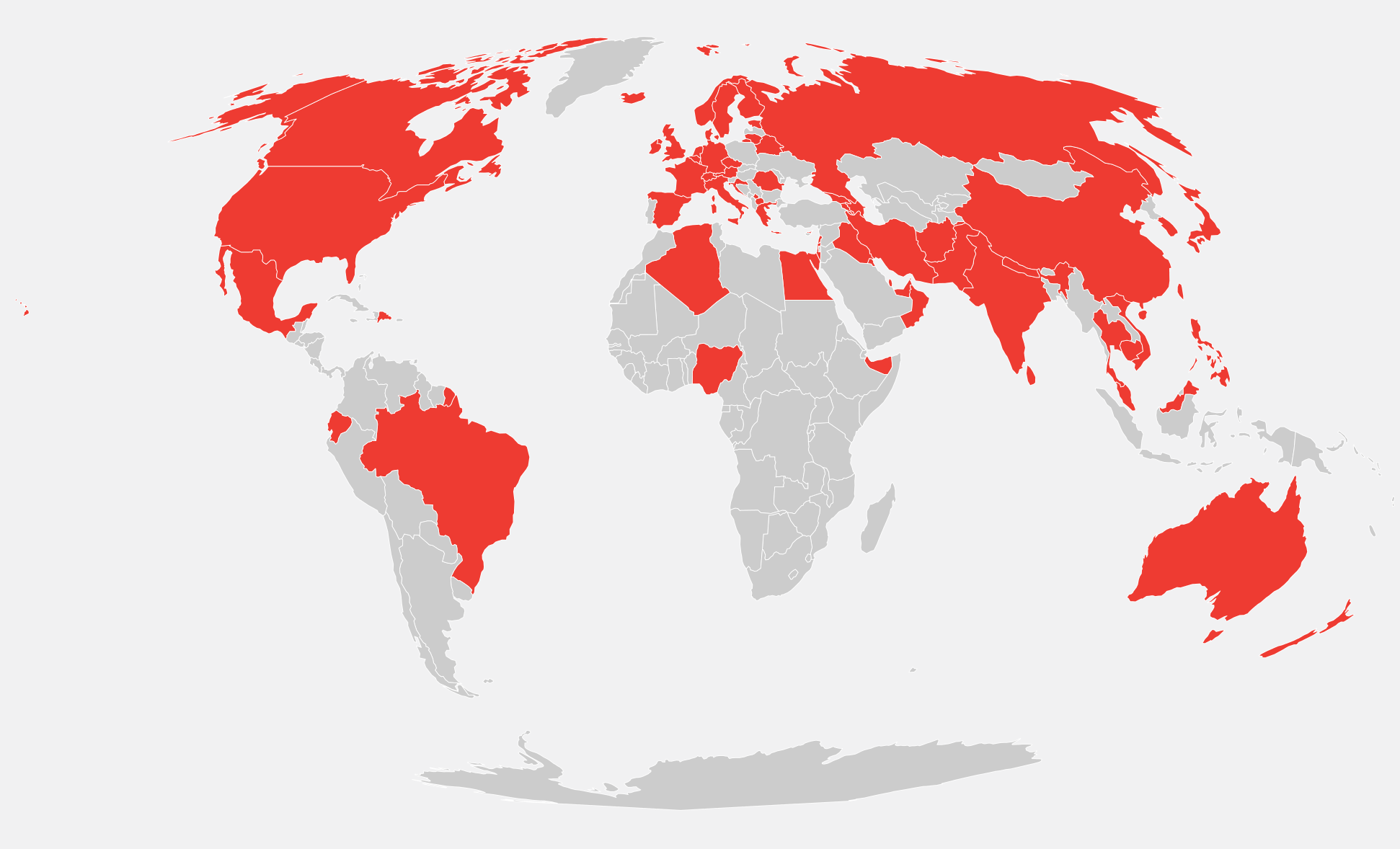
Cont'd.
LINK:
https://www.buzzfeednews.com/article/peteraldhous/coronavirus-updating-charts-maps